17 Hidden Messages In Old Commercial Logos That’ll Blow Your Mind
Ever stared at a logo and felt like it was trying to tell you something? Spoiler alert: it probably was. Welcome to the wonderfully sneaky world of hidden messages in logos—where what you don’t see at first glance is exactly what makes them genius.
These aren’t just pretty designs slapped on packaging; they’re riddles, winks, and subtle brand nods hiding in plain sight.
Some play tricks with negative space, others sneak in clever symbols, and a few are just straight-up optical illusions that’ll have you questioning everything you thought you knew about cereal boxes and delivery vans.
Once these Easter eggs are revealed, your supermarket strolls and online shopping sprees will never be the same—you’ll be spotting secrets like a design detective. So buckle up and get ready to squint, gasp, and grin as we uncover 17 logos with hidden messages that’ll totally blow your mind. Trust us—you’ll never unsee them.
1. FedEx – The Famous Hidden Arrow
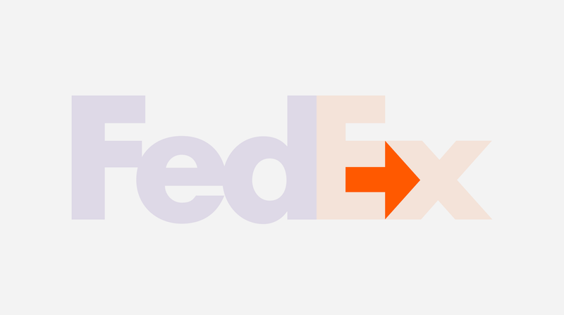
You’ve seen it a thousand times, but once you spot the arrow between the ‘E’ and the ‘x,’ you can’t unsee it. It’s like the logo’s quietly whispering “speed and precision” the whole time. The arrow hidden in the FedEx logo is a symbol of the company’s efficiency and forward-thinking approach.
It’s a clever use of negative space between the two letters that forms the arrow, representing the company’s dedication to getting packages from one place to another with speed and accuracy. The design choice reflects FedEx’s core business values and has contributed to making the logo iconic worldwide.
The interesting part is how easily it can be overlooked, yet once noticed, it becomes impossible to ignore. This clever piece of design work is a testament to the power of subtlety in brand identity. Next time you see a FedEx truck zooming past, you’ll remember this little secret hidden in plain sight!
2. Tostitos – The Chip Party in the Middle
Look closely at the two T’s and the ‘i’ between them: they’re two people sharing a chip over a bowl of salsa. It’s literally a fiesta inside the word. This playful design captures the essence of Tostitos as a snack that’s meant to be shared during fun, social gatherings.
The logo turns a simple word into a lively scene of two friends or party-goers enjoying the product together, making every bag of chips feel like an invitation to a party. It’s an artistic representation of the brand’s focus on bringing people together over a shared love for chips and salsa.
The creative visualization adds a layer of fun to the logo and makes it memorable and engaging. Each time you open a bag of Tostitos, you’re reminded of the joy and connection that sharing snacks with friends can bring. It’s a visual celebration of togetherness, right in the middle of the brand name!
3. Baskin-Robbins – The 31 Flavors Are Right There
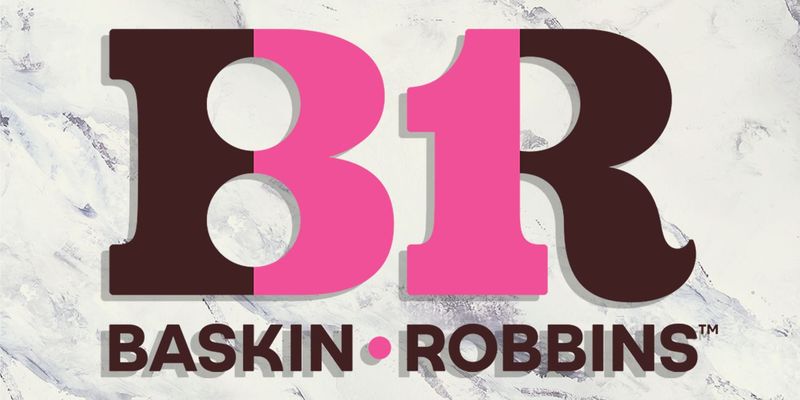
The pink parts of the ‘B’ and ‘R’ cleverly make a ’31’—the original number of flavors. A scoop of graphic design brilliance. Baskin-Robbins has been known for its wide variety of ice cream flavors since its inception, and this hidden ’31’ is a nod to that legacy.
It’s a playful and clever way to integrate a brand promise into the logo itself. By embedding the number of flavors within the initials, the logo becomes a visual reminder of the delicious array of choices Baskin-Robbins offers. It’s an iconic piece of branding that has stood the test of time.
Every time you see the logo, it’s a sweet reminder of the brand’s commitment to variety and quality. It’s as if the logo itself is winking at you, saying, “There’s always something new to try!” This hidden gem within the logo is a testament to clever design and brand storytelling.
4. Goodwill – Smiley Face in the “G”
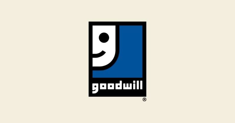
That friendly smile? It’s not just the logo’s mascot—it’s also built right into the ‘G.’ Double the cheer, double the clever. The Goodwill logo is all about spreading positivity and goodwill among communities. The ‘G’ in the logo is designed in such a way that it forms a smiling face, symbolizing happiness and community service.
It’s a simple yet effective design that conveys the brand’s mission to help people through donations and sustainable retail practices. The smiley face is more than just a design element; it represents the joy and hope that Goodwill brings to many individuals and families.
Each time you see the logo, it’s a reminder of the good that the organization does in the world. This clever design choice makes the logo not only memorable but also meaningful. It’s a perfect example of how a simple design can encapsulate the essence of a brand.
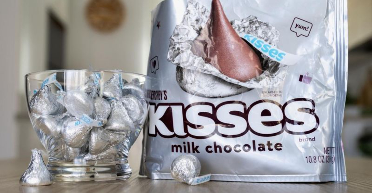
5. Hershey’s Kisses – Hidden Kiss Between the K and I
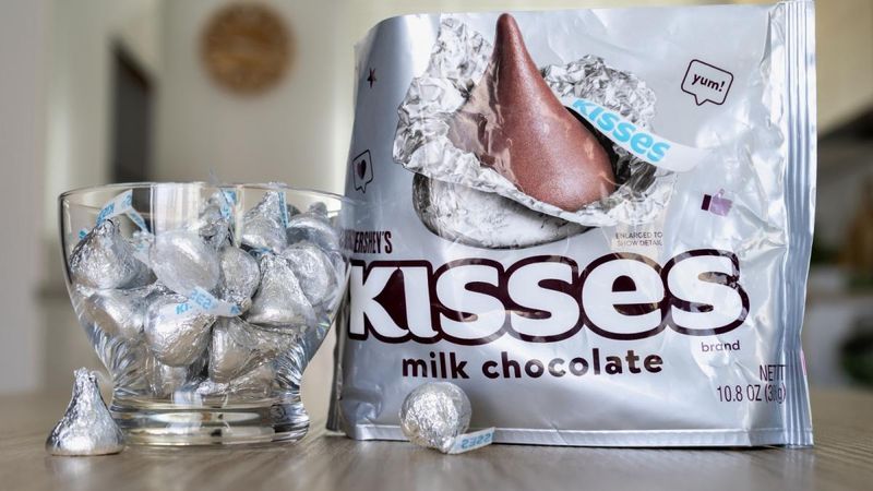
Tilt your head slightly. That little triangular shape between the ‘K’ and ‘I’ is a sideways chocolate Kiss. Sweet subliminal messaging. Hershey’s Kisses are iconic chocolates, and this hidden element in the logo reflects the brand’s playful and fun nature. The cleverly placed Kiss shape is a nod to the product itself, adding an extra layer of meaning to the logo.
It’s a subtle and delightful discovery for those who take a closer look. The design is a perfect example of how a logo can incorporate product elements in a way that’s both clever and endearing. This hidden Kiss adds character to the brand and makes the logo a conversational piece.
Each time you unwrap a Hershey’s Kiss, you’re reminded of the little secret tucked away in the logo. It’s a sweet surprise that enhances the brand’s identity and connects with consumers on a more personal level.
6. Tour de France – Cyclist in the Lettering
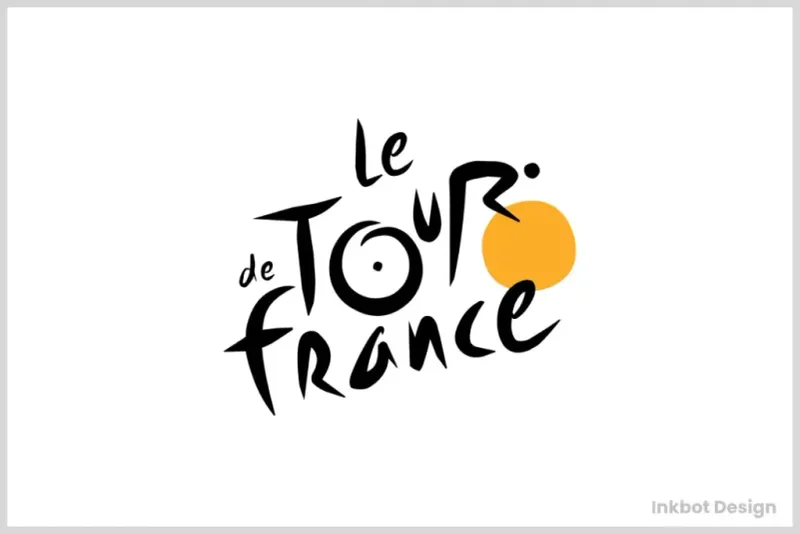
The ‘R’ is a rider, the ‘O’ is a wheel, and the whole thing is a hidden cyclist mid-race. Now that’s a tour de force. The Tour de France logo is a brilliant piece of design that captures the essence of the event. By incorporating a cyclist into the lettering, the logo becomes a dynamic representation of the race itself.
The clever use of negative space turns simple letters into an iconic image that resonates with cycling enthusiasts worldwide. It’s a visual metaphor for the thrill and excitement of the race, cleverly integrated into the logo.
This hidden cyclist adds a layer of meaning to the logo and makes it more than just a name. It’s a celebration of the sport and the athletes who compete in the Tour de France. This imaginative design choice makes the logo memorable and adds depth to the brand, reflecting the prestige and history of the event.
7. LG – The Smiley Face That’s Also… Pac-Man?

The ‘L’ and ‘G’ form a face, but if you rotate the ‘G’ just a bit… hello, retro video game vibes. The LG logo is an interesting fusion of modern technology and playful nostalgia. Designed to resemble a human face, it conveys warmth and approachability. But there’s a hidden twist: rotate the ‘G,’ and it looks like everyone’s favorite 80s video game character, Pac-Man.
This clever design adds a layer of fun to the brand, connecting with consumers both young and old. The playful nod to a classic game is a creative way to make the logo more engaging and memorable.
It reflects LG’s innovative spirit and its ability to blend cutting-edge technology with elements of pop culture. This dual identity makes the logo a conversation starter and enhances the brand’s appeal. Each time you see it, you might just find yourself reminiscing about those arcade days.
8. NBC – The Peacock in Full Flair
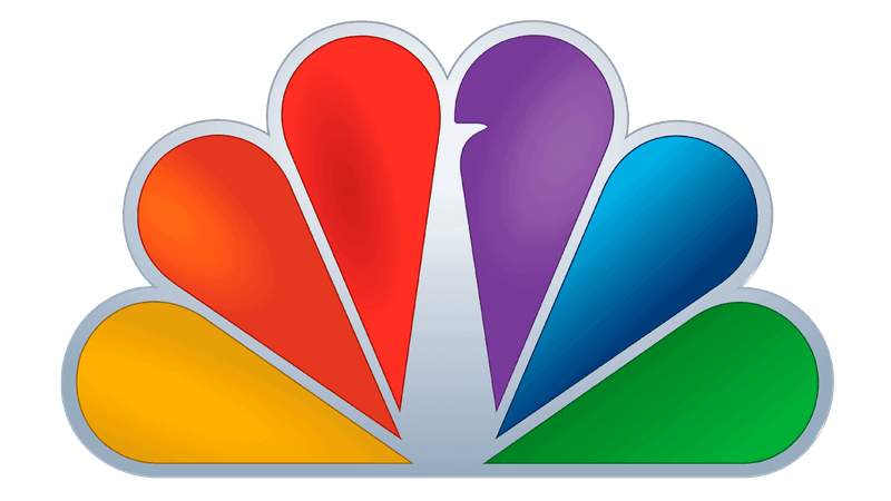
All those colors? A peacock with its tail fanned out. The beak’s hidden in the white space, facing right—because forward thinking, baby. The NBC logo is a vibrant and dynamic representation of the network’s diverse programming. The peacock, a symbol of color and beauty, reflects NBC’s commitment to quality and innovation in broadcasting.
The clever use of negative space to create the peacock’s beak adds an element of sophistication to the design. This iconic logo is a visual metaphor for the network’s ability to adapt and evolve over time, always looking forward to the future.
The colorful feathers represent the variety of content offered by NBC, from news to entertainment, making it a household name. This hidden gem within the logo adds depth and meaning, making it more than just a symbol—it’s a representation of the network’s rich history and legacy.
9. Amazon – More Than a Smile

That arrow from A to Z isn’t just cheerful—it says they sell everything from A to Z. Mind. Blown. The Amazon logo is a masterclass in simple yet effective design. The arrow not only forms a smile, representing customer satisfaction, but also signifies the wide range of products available on the platform.
It’s a clever visual cue that embodies Amazon’s mission to be the go-to place for all your shopping needs. The logo is a testament to Amazon’s customer-first approach and its commitment to delivering a seamless shopping experience.
This clever design makes the logo instantly recognizable and memorable, reinforcing the brand’s identity. Each time you see it, you’re reminded of the convenience and variety that Amazon offers. It’s a logo that speaks volumes without saying a word, capturing the essence of a company that’s changed the way we shop.
10. Toyota – Every Letter of Their Name in One Symbol
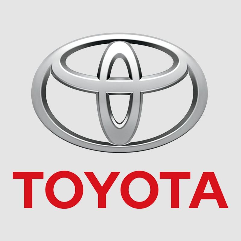
It’s not just an abstract symbol—each letter in ‘Toyota’ can be found in the overlapping ovals. It’s like logo-level Sudoku. The Toyota logo is a brilliant piece of design that combines simplicity with complexity. At first glance, it appears to be a series of overlapping ovals, but look closer, and you’ll see each letter of the company’s name cleverly embedded within.
This hidden feature adds a layer of intrigue to the logo, making it more than just a brand mark—it’s a puzzle waiting to be solved. The logo reflects Toyota’s commitment to innovation and attention to detail, qualities that have made it a leader in the automotive industry.
This clever design choice makes the logo memorable and engaging, encouraging viewers to take a closer look. It’s a perfect example of how a logo can communicate a brand’s values and identity in a subtle yet powerful way.
11. Pittsburgh Zoo – Hidden Animals in the Negative Space
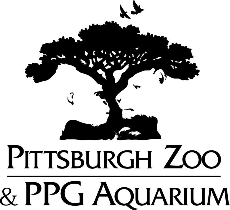
Look at the tree carefully—you’ll see a gorilla and lion facing each other in the white space. Nature’s hiding in plain sight. The Pittsburgh Zoo logo is a masterpiece of negative space design. By cleverly embedding the silhouettes of a gorilla and a lion within the tree, the logo captures the essence of the zoo as a place where wildlife and nature coexist.
This hidden imagery adds depth and intrigue to the logo, making it more than just a representation of the zoo—it’s a symbol of the wonder and beauty of the animal kingdom. The design invites viewers to look closer and discover the hidden treasures within, reflecting the zoo’s mission to educate and inspire.
This creative approach makes the logo memorable and engaging, encouraging people to explore the world of wildlife and conservation. It’s a visual celebration of the zoo’s commitment to protecting and preserving the natural world.
12. Spartan Golf Club – Two Images in One
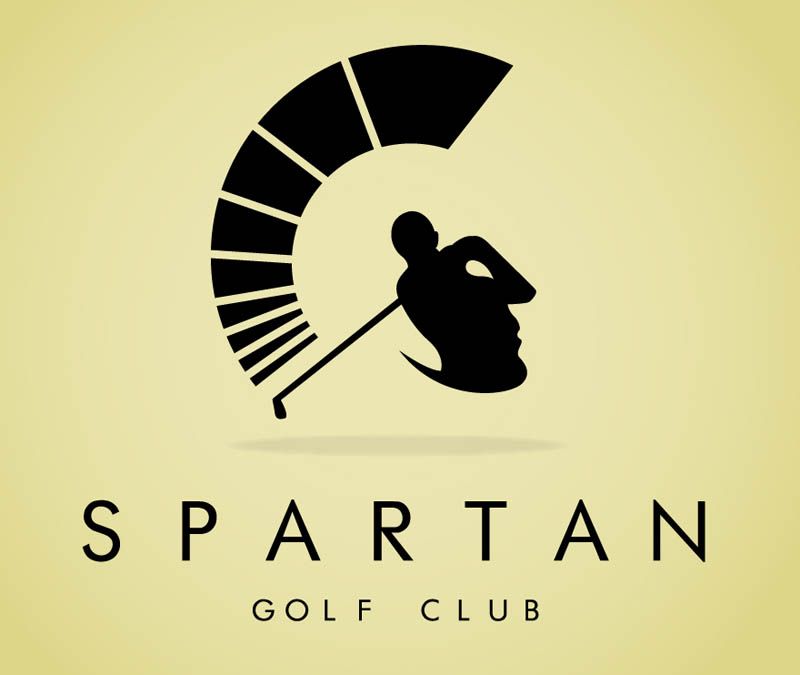
It’s a golfer swinging—and also a Spartan helmet. Dual identity, full power. The Spartan Golf Club logo is a brilliant example of dual imagery in design. By cleverly combining the silhouette of a golfer with the shape of a Spartan helmet, the logo captures the spirit of the club as a place of strength, precision, and tradition.
This hidden imagery adds a layer of meaning to the logo, making it more than just a brand mark—it’s a symbol of the club’s values and identity. The design reflects the club’s commitment to excellence and its dedication to preserving the legacy of the game.
This imaginative approach makes the logo memorable and engaging, encouraging viewers to take a closer look and discover the hidden elements within. It’s a visual representation of the club’s unique blend of history and modernity, making it a standout in the world of golf.
13. Milwaukee Brewers (Old Logo) – M and B in a Baseball Glove
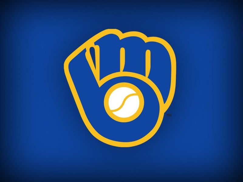
Looks like a simple mitt at first glance… but it’s actually an ‘M’ and a ‘B’ cleverly morphed into baseball glory. The old Milwaukee Brewers logo is a genius piece of design that combines sports imagery with clever typography. By transforming the letters ‘M’ and ‘B’ into the shape of a baseball glove, the logo captures the spirit of the team and its love for the game.
This hidden feature adds depth and intrigue to the logo, making it more than just a representation of the team—it’s a symbol of the passion and dedication that goes into every game. The design reflects the team’s commitment to excellence and its connection to the community.
This playful approach makes the logo memorable and engaging, encouraging fans to take a closer look and discover the hidden elements within. It’s a visual celebration of the team’s rich history and its role in the world of baseball.
14. Coca-Cola – Hidden Denmark Flag
Between the ‘o’ and ‘l’ is a subtle nod to the Danish flag. Why? Because Denmark is allegedly one of the happiest countries. Marketing or coincidence? Either way, it’s there. The Coca-Cola logo is a classic piece of design that has become iconic worldwide.
This hidden element adds a layer of intrigue to the logo, making it more than just a brand mark—it’s a playful connection to the brand’s global reach and its ability to bring joy to people around the world. The design invites viewers to look closer and discover the hidden treasures within, reflecting the brand’s mission to spread happiness and refreshment.
This clever approach makes the logo memorable and engaging, encouraging people to explore the world of Coca-Cola. It’s a visual celebration of the brand’s commitment to bringing people together and creating moments of joy.
15. Gillette – Razor Sharp Letters
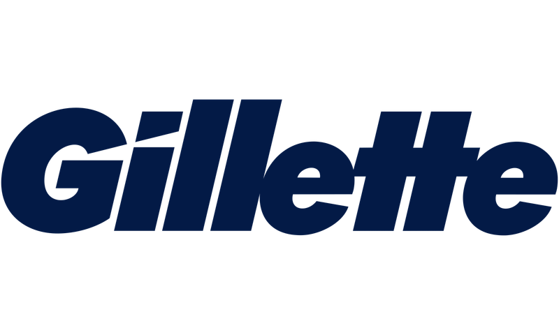
The ‘G’ and ‘i’ are sliced clean through like they’ve been… well, shaved. Subtle. Sharp. On-brand. The Gillette logo is a masterclass in minimalism and precision. By incorporating razor-sharp edges into the letters, the logo becomes a visual representation of the brand’s core product.
This clever design adds a layer of meaning to the logo, making it more than just a brand mark—it’s a symbol of the brand’s commitment to quality and innovation. The design reflects Gillette’s mission to deliver a superior shaving experience, making it a trusted name in the world of grooming.
This sharp approach makes the logo memorable and engaging, encouraging consumers to take a closer look and discover the hidden elements within. It’s a visual celebration of the brand’s dedication to excellence and its role in the world of personal care.
16. Carrefour – Hidden “C” in the Arrows
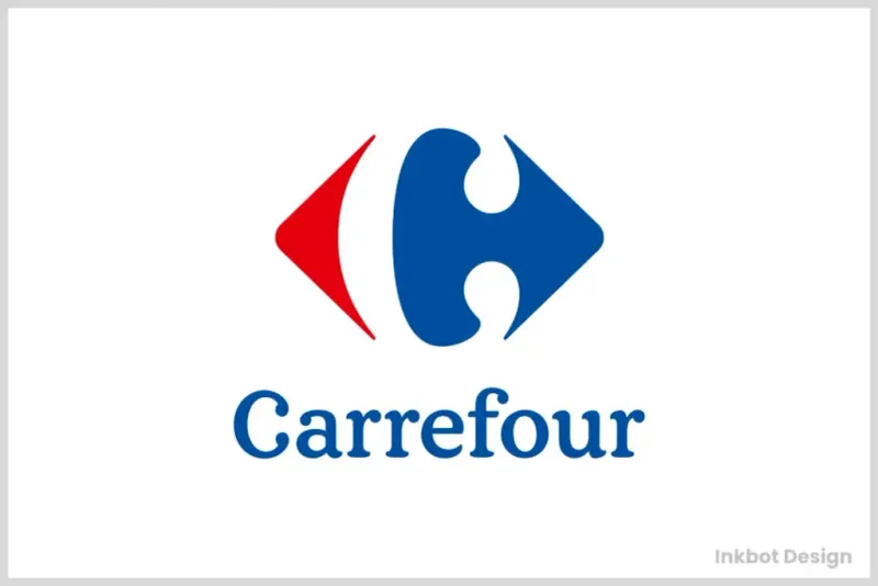
Two arrows point in opposite directions, and nestled between them is a white ‘C’ in the negative space. French for ‘crossroads,’ and design for genius. The Carrefour logo is a brilliant piece of design that captures the essence of the brand. By cleverly embedding a ‘C’ within the arrows, the logo becomes a visual representation of the brand’s global reach and its commitment to providing a wide range of products.
This hidden element adds depth and intrigue to the logo, making it more than just a brand mark—it’s a symbol of the brand’s values and identity. The design reflects Carrefour’s mission to be a leader in the retail industry, offering quality and variety to consumers worldwide.
This clever approach makes the logo memorable and engaging, encouraging viewers to take a closer look and discover the hidden elements within. It’s a visual celebration of the brand’s commitment to excellence and innovation.
17. Sun Microsystems – Infinite “U”s

The diamond-shaped logo is made entirely of the word ‘sun,’ rotated in such a way that it reads from all directions. It’s not a logo. It’s a brain teaser. The Sun Microsystems logo is a masterpiece of design that combines simplicity with complexity.
By arranging the letters in a diamond shape, the logo becomes a visual representation of the brand’s innovative spirit and its commitment to excellence in the technology industry. This hidden element adds a layer of intrigue to the logo, making it more than just a brand mark—it’s a symbol of the brand’s values and identity.
The design invites viewers to look closer and discover the hidden elements within, reflecting the brand’s mission to be a leader in the world of technology. This clever approach makes the logo memorable and engaging, encouraging viewers to explore the world of Sun Microsystems. It’s a visual celebration of the brand’s commitment to innovation and excellence.