
18 Fast-Food Packaging Designs From The ’70s And ’80s That Were Totally Crazy
Growing up in the ’70s and ’80s, fast food was more than just a quick bite — it was an event. Sure, the burgers and fries were tasty, but half the fun was in the packaging.
Back then, fast food chains weren’t just selling meals; they were selling magic, wrapped in boxes, bags, and cups that practically shouted for your attention. We’re talking psychedelic colors, cartoon mascots, wild fonts, and containers shaped like spaceships or treasure chests.
Every meal felt like unwrapping a gift — and sometimes, it actually came with a toy. These weren’t just wrappers; they were works of pop art, cleverly designed to stick in your memory long after the food was gone. In an era without smartphones, that packaging was the entertainment.
So let’s take a gloriously greasy stroll down memory lane and revisit the fast food packaging that made every drive-thru feel like a trip to a neon wonderland.
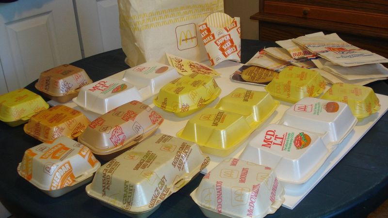
1. McDonald’s Styrofoam Clamshell Burger Box
Remember that satisfying snap when you opened a McDonald’s clamshell? I still catch myself mimicking that sound sometimes! These foam containers were the crown jewels of ’80s fast food packaging, keeping Quarter Pounders hot and preventing that dreaded soggy bun situation.
The clamshell’s interior had those little ridges that elevated your burger like it was sitting on a throne. Plus, the condensation that formed inside created this mini greenhouse effect that somehow made everything taste better—or at least that’s what my 10-year-old brain believed.
While environmental concerns eventually doomed these Styrofoam wonders to extinction, they remain iconic symbols of a time when convenience trumped conservation. The golden arches emblazoned on that puffy white box promised consistent deliciousness in an increasingly chaotic world.
2. Pizza Hut’s Red Roof Personal Pan Pizza Box
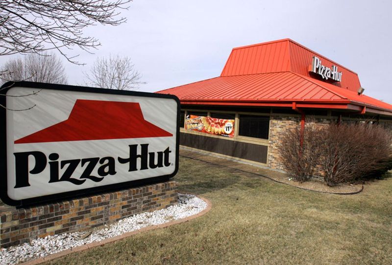
Whoever designed Pizza Hut’s personal pan pizza boxes deserves a Nobel Prize for childhood joy creation! These miniature cardboard houses with their iconic red roofs made me feel like I owned real estate at age eight. My mom would bring one home as a special treat when I aced a spelling test.
The box wasn’t just cute—it was functional engineering at its finest. Those little tabs kept the lid secure during the ride home, while the bottom had mysterious air holes that somehow kept the crust crispy instead of soggy. The waxed interior prevented cheese from permanently bonding with the cardboard.
Opening that tiny red roof revealed a perfect circle of cheesy goodness that was ALL MINE—no sharing required. For a kid in the ’80s, nothing said “you’re special” quite like having your very own pizza in a house-shaped box.
3. McDonald’s McDonaldland Cookies Boxes
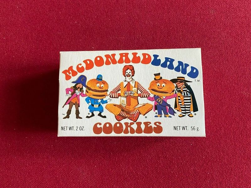
Snagging a box of McDonaldland cookies was like hitting the childhood jackpot! Those circus wagon-style boxes featured the whole gang—Ronald, Grimace, Hamburglar, and friends—in a parade of colorful mischief that was almost too fun to throw away.
The box itself was a marvel of ’70s design excess, with vibrant primary colors and character illustrations that practically jumped off the cardboard. I’d carefully open mine along the perforated edge, preserving the box for later adventures. The cookies inside were nothing special—basically animal crackers in disguise—but that wasn’t the point.
Mom would find these empty boxes repurposed as homes for action figures or treasure chests for my rock collection weeks later. McDonaldland cookie packaging wasn’t just containing cookies; it was fueling imagination and proving that sometimes the wrapper is as memorable as what’s inside.
4. Burger King’s Specialty Sandwich Boxes
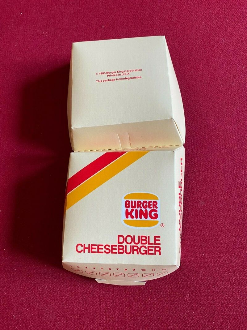
Burger King launched their specialty sandwich line with packaging that screamed “This is NOT just another burger!” Those long, rectangular boxes from the early ’80s made me feel like I was unwrapping something prestigious rather than just another fast-food sandwich.
The boxes featured bold geometric patterns in Burger King’s signature orange, red, and blue color scheme. My dad would bring home Whaler fish sandwiches in these fancy containers after work sometimes, and the whole ritual of sliding out that neatly packaged sandwich made dinner feel like a special occasion.
Unlike McDonald’s foam, BK opted for paperboard that unfolded like origami. The structural integrity was questionable—especially with sauce-heavy options—but the presentation was undeniably premium. These boxes transformed ordinary chicken sandwiches into events, proving that perception is everything when it comes to fast food enjoyment.
5. KFC’s Striped Bucket with Colonel’s Face
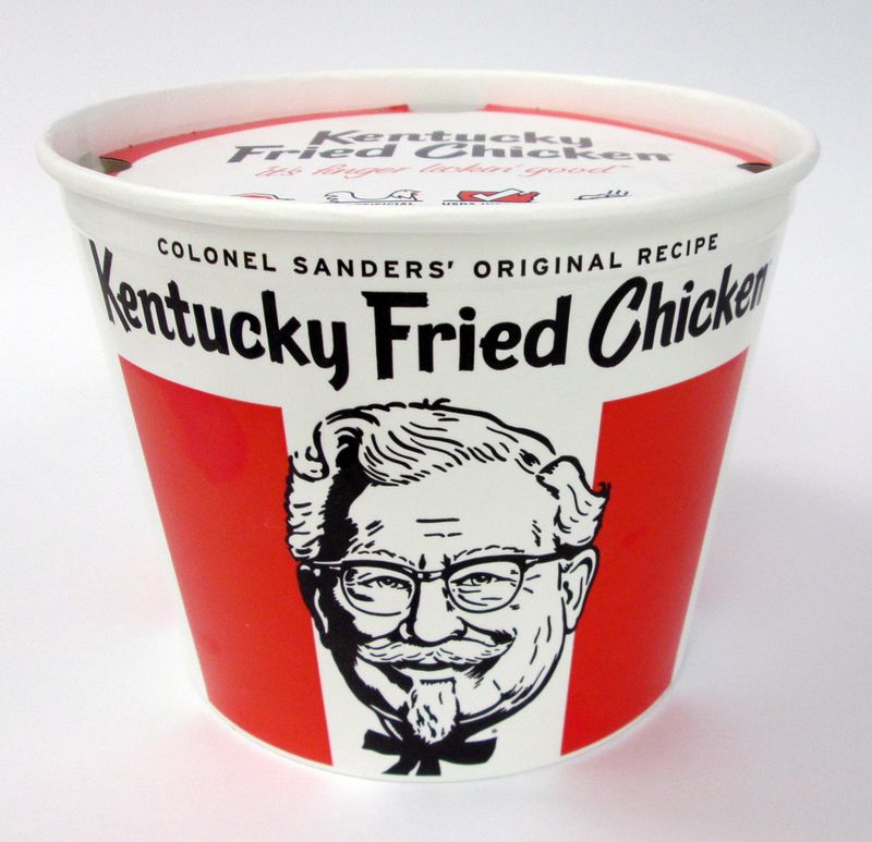
Nothing announced “feast time” to my family like Dad walking through the door with KFC’s iconic red and white striped bucket! That cylindrical cardboard vessel, crowned with Colonel Sanders’ kindly face, wasn’t just packaging—it was a promise of good times ahead.
The engineering was brilliant: cardboard thick enough to insulate that precious fried chicken while the handle made it portable enough for picnics. Steam would rise from those little vents as you peeled back the lid, releasing that mouthwatering aroma that made waiting for plates nearly impossible.
Our family dog would sit at attention the moment that bucket appeared, knowing chicken bones might be in his future. The empty buckets later served as makeshift drums, storage containers for toys, or even Halloween candy collectors. KFC’s bucket design has survived decades virtually unchanged—proof that some packaging achieves timeless perfection.
6. Taco Bell’s Taco Holders and Wrappers
Taco Bell’s psychedelic wrappers from the late ’70s were like edible Woodstock tickets! Those purple, pink and orange geometric patterns made unwrapping your taco feel like a groovy experience. My teenage sister would save these wrappers to decorate her bedroom walls—seriously!
The real genius was their cardboard taco holders that solved the eternal problem of taco collapse. Those little cardboard cradles cradled your fragile taco like it was a newborn baby, preventing the dreaded first-bite catastrophe where all your toppings land in your lap. The paper had that special coating that somehow kept the grease contained without making the shell soggy.
Each wrapper featured Spanish-inspired patterns that made fast food feel vaguely international and exotic. While today’s Taco Bell packaging is sleeker and more minimalist, nothing matches the bold personality of those ’70s wrappers that turned every taco into a fiesta.
7. Wendy’s Yellow Burger Wrappers with Folded Corners
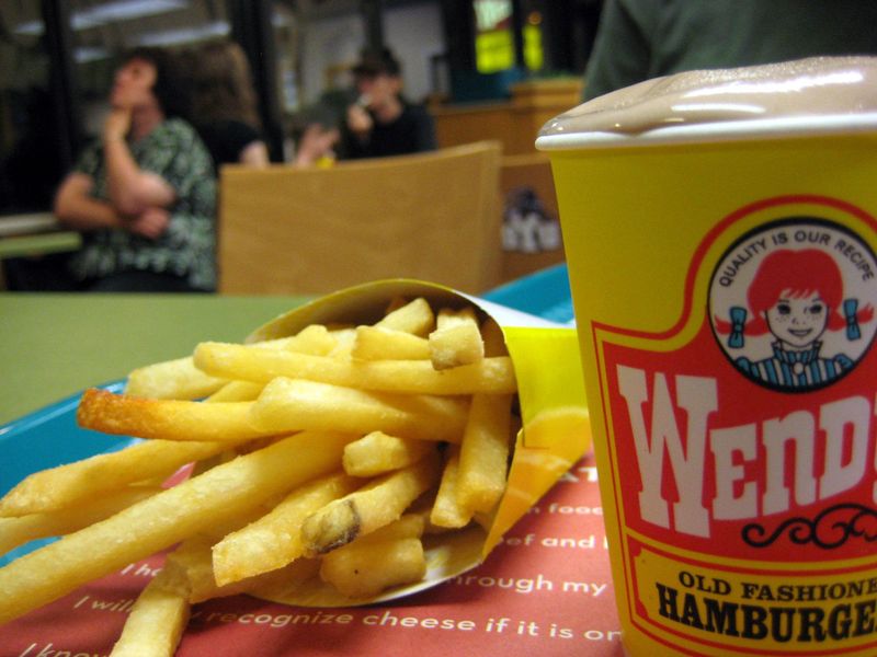
Wendy’s square burgers demanded equally distinctive packaging! Those yellow wrappers with the folded corners were like little presents waiting to be unwrapped. My grandpa would quiz me on reading the wrapper’s fun facts while we waited for our food.
Unlike other fast-food joints that hid their burgers completely, Wendy’s semi-open design proudly displayed their square patty peeking out from those folded corners. The wax paper had just enough heft to catch dripping burger juices without disintegrating mid-meal. That cheerful yellow color with red lettering stood out in a sea of white and brown packaging.
The wrapper even doubled as a makeshift placemat when fully opened. Wendy’s founder Dave Thomas insisted on practicality in everything, and these wrappers delivered function alongside distinctive branding. While simple compared to some flashier competitors, these wrappers perfectly embodied Wendy’s no-nonsense, quality-focused approach.
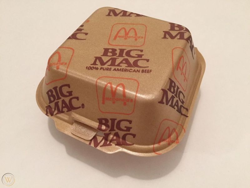
8. McDonald’s Big Mac Styrofoam Container
The Big Mac’s special foam container made this burger feel like royalty in the fast food kingdom! That two-tiered clamshell perfectly mirrored the sandwich’s architecture—each half had its own compartment, like the burger was getting the presidential suite of packaging.
Opening it revealed a perfect presentation every time, with that middle bun exactly centered. The container’s rim had this textured grip area that prevented slippery fingers from dropping your precious Big Mac. I’d always carefully arrange my fries around it like it was the centerpiece of a fancy table setting.
The container featured that classic Big Mac jingle printed on the side: “Two all-beef patties, special sauce, lettuce, cheese…” which I memorized before I knew my multiplication tables. While environmentally questionable by today’s standards, that distinctive package design helped transform the Big Mac from mere sandwich into cultural icon.
9. Long John Silver’s Pirate-Themed Treasure Chest Meal Box
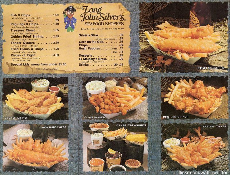
Shiver me timbers, Long John Silver’s treasure chest meal boxes were the closest thing to actual pirate booty a 1980s kid could hope for! These cardboard containers transformed ordinary fish and chips into swashbuckling adventures with their blue and yellow nautical designs.
The box opened like an actual treasure chest, complete with a handle that made carrying your seafood bounty feel like you’d just plundered it from enemy ships. Inside, those little compartments kept your hush puppies from fraternizing with your fish—very important when you’re seven and foods touching is basically a tragedy.
My brother and I would save these boxes for backyard pirate games long after the food was gone. The illustrations featured cartoonish pirates and treasure maps that sparked imagination. While other fast food joints were just serving meals, Long John Silver’s was selling maritime fantasy with a side of tartar sauce.
10. Dairy Queen’s Candy-Striped Sundae Cups
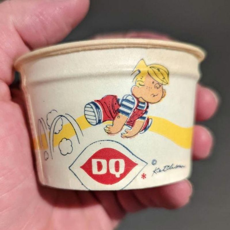
Dairy Queen’s candy-striped sundae cups from the ’70s were summer incarnate! Those red and white vertical stripes made even a small treat feel festive and special. I can still hear the particular sound of metal spoon against waxed cardboard as I scraped to get every last drop of hot fudge.
The cup’s structural engineering was surprisingly complex for something so disposable. The rolled rim provided strength without adding bulk, while the slightly tapered shape made it comfortable to hold even with ice-cream-chilled fingers. The wax coating kept everything contained while somehow not making the ice cream taste waxy.
These cups performed double-duty as impromptu megaphones for bored kids in the back seat during the drive home. DQ’s striped cups were so iconic that just seeing those red and white stripes could trigger instant ice cream cravings—a Pavlovian response that marketing executives must have absolutely loved.
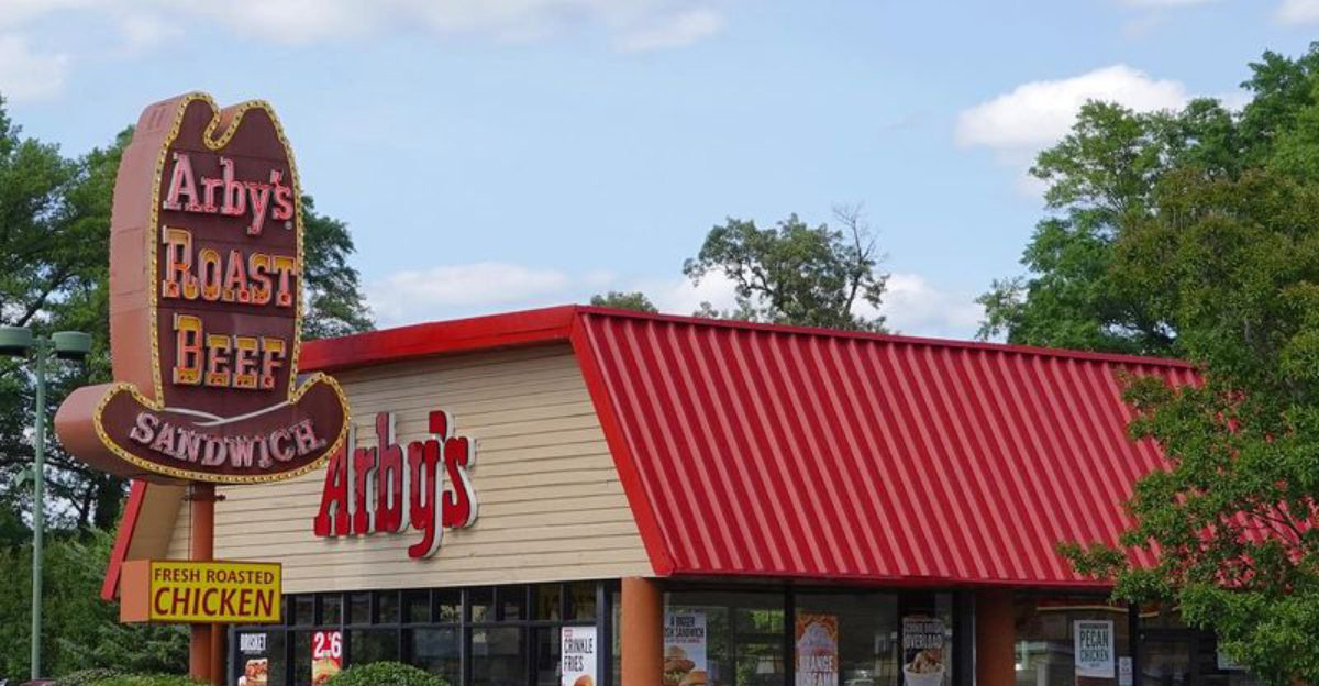
11. Arby’s Cardboard Cowboy Hat Containers
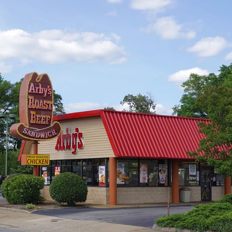
Arby’s commitment to their cowboy hat logo extended to their sandwich packaging in the most delightful way! Those cardboard containers shaped like miniature cowboy hats made every roast beef sandwich feel like it came with its own Western movie.
The design was both playful and practical—the curved shape cradled their signature roast beef perfectly while catching any wayward Horsey Sauce. My dad would always tip an imaginary hat when the server handed him his sandwich, much to my teenage embarrassment. The red and beige color scheme perfectly matched their branding, making Arby’s meals instantly recognizable in a crowded food court.
Each container had that little tab and slot closure system that was oddly satisfying to secure. While other chains went for boxes or wraps, Arby’s leaned hard into their brand identity with packaging that was memorable enough to become part of pop culture—proving that sometimes the silliest ideas are the most effective.
12. Hardee’s California Raisins Collector Cups
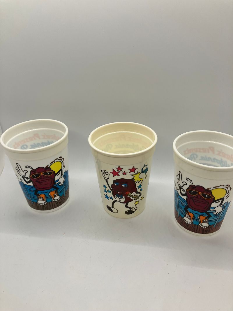
Hardee’s California Raisins cups were the ultimate status symbol in my third-grade classroom! These plastic cups featured those dancing claymation raisins that dominated ’80s pop culture, turning ordinary drink containers into coveted collectibles.
Each colorful cup showcased a different raisin character striking a musical pose, with that unmistakable “I Heard It Through the Grapevine” vibe. The plastic had this slightly pearlescent quality that made the cups seem more special than regular drinkware. My family’s kitchen cabinet gradually filled with these promotional treasures as we made repeated Hardee’s visits specifically to complete our collection.
The cups were surprisingly durable—many families still have these decades later! Hardee’s brilliantly tapped into the collector mentality, creating a promotion where the packaging became more valuable than the product it contained. These weren’t just cups; they were tangible pieces of ’80s marketing genius that turned fast food into treasure hunts.
13. Roy Rogers’ Silver Dollar Pancake Container
Roy Rogers’ silver dollar pancake containers were breakfast magic in cardboard form! Shaped like oversized silver dollars complete with embossed details, these containers made morning meals feel like cowboy treasure. My sister and I would flip a real coin to see who got the special container when we stopped during road trips.
The circular container had this satisfying pop when you broke the seal to reveal perfectly stacked mini pancakes inside. Steam would escape through clever vents that prevented sogginess while keeping everything warm. The silver-colored printing mimicked actual coin details, including stars and liberty-inspired imagery that tied into the restaurant’s Western theme.
Parents appreciated the practical design that kept syrup contained and prevented breakfast disasters in moving vehicles. Roy Rogers knew their audience—kids loved the novelty while adults valued the functionality. These containers transformed ordinary pancakes into memorable experiences that had us begging to return.
14. McDonald’s Halloween Boo Buckets
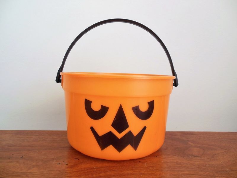
McBoo Buckets weren’t just Happy Meal containers—they were cultural phenomena that marked the official start of Halloween season! First appearing in 1986, these orange jack-o’-lantern pails replaced the standard Happy Meal box during October and instantly became seasonal icons.
The simple plastic buckets featured three different face designs: the standard pumpkin smile, McBoo (slightly scared), and McGoblin (more mischievous). I’d start pestering my mom about when the Boo Buckets would arrive sometime around Labor Day. The bucket’s handle was sturdy enough to actually use for trick-or-treating later—talk about sustainable packaging!
McDonald’s later expanded the line with white ghost and green witch versions, creating collection frenzies. These buckets achieved that marketing miracle of making kids beg for specific packaging over the actual food inside. Decades later, adults still experience nostalgic joy when McDonald’s occasionally revives these seasonal classics.
15. Wendy’s “Where’s the Beef?” Takeout Bags
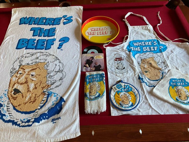
Wendy’s struck marketing gold with their “Where’s the Beef?” campaign, and naturally, they plastered that catchphrase all over their takeout bags! Those brown paper bags with bold red lettering turned customers into walking advertisements during the height of the slogan’s popularity in 1984.
The bags featured that iconic elderly lady Clara Peller with her outraged expression and the catchphrase in huge letters. My dad would deliberately ask for extra bags just to collect them—they became impromptu lunch bags for school the next day. The phrase became so ubiquitous that even presidential candidates started using it in debates!
Unlike today’s more generic packaging, these bags were conversation starters. People would spot you carrying one and shout the catchphrase, creating this weird sense of fast-food community. Wendy’s successfully transformed ordinary takeout bags into pop culture artifacts that extended their advertising reach far beyond the restaurant doors.
16. Pizza Hut’s “Book It!” Personal Pan Pizza Certificates
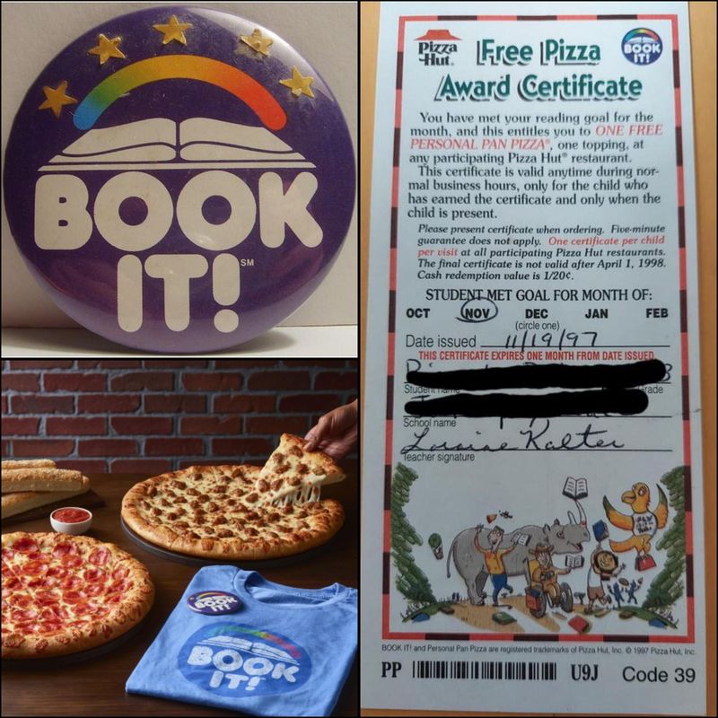
Pizza Hut’s “Book It!” program turned reading into an edible reward with those coveted personal pan pizza certificates! Launched in 1984, these colorful paper vouchers were academic currency for elementary school kids—read enough books, earn free pizza.
The certificates featured cartoon characters celebrating reading alongside the Pizza Hut logo, printed on paper that somehow felt more special than regular paper. My second-grade teacher would ceremoniously hand these out on Fridays, making recipients feel like they’d won the lottery. Walking into Pizza Hut clutching that certificate gave me this rush of pride and importance that no other restaurant experience could match.
Parents loved the program for encouraging reading while kids developed this Pavlovian response connecting books with cheese and pepperoni. These certificates weren’t just pizza vouchers—they were genius marketing that created lifelong Pizza Hut customers through positive childhood associations. I still get a little dopamine hit when I finish a book!
17. Kentucky Fried Chicken’s Astronaut-Inspired Spork
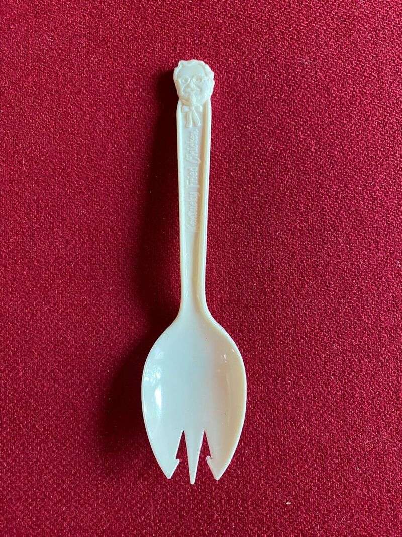
KFC’s space-age spork was the Swiss Army knife of fast food utensils! This revolutionary hybrid of spoon and fork came in futuristic white plastic that seemed straight out of The Jetsons. My brother and I would actually argue over who got to use these quirky utensils when the family bucket arrived.
The design was supposedly inspired by actual NASA equipment—part of that 1970s space program influence that seeped into everyday products. The spork’s tines were just long enough to spear chicken but rounded enough to scoop mashed potatoes and gravy. Each one came individually wrapped in clear plastic with the Colonel’s face, adding to that sense of specialized dining equipment.
KFC servers would toss handfuls of these into your takeout bag like they were nothing special, not realizing they were distributing what would become nostalgic artifacts. These sporks represented that uniquely ’70s optimism about technology improving even the most mundane aspects of life—even eating fried chicken.
18. McDonald’s Changeables Happy Meal Toys/Containers
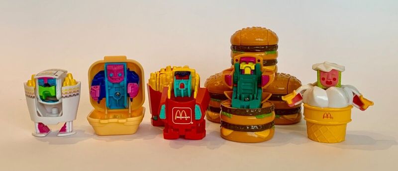
McDonald’s Changeables were the ultimate food-disguised-as-robots concept that blew my eight-year-old mind! Introduced in 1987, these Happy Meal toys transformed from mini McDonald’s food items into robot action figures with a few simple moves.
The packaging was part of the play experience—each toy came in a special compartment within the Happy Meal box, with illustrations showing the transformation sequence. I’d carefully follow the diagrams to turn my Big Mac container into a standing robot with movable arms.
My elementary school playground became a battleground of Changeables during recess. These weren’t just toys; they were status symbols that proved your parents had taken you to McDonald’s recently. The genius marketing created a bizarre scenario where kids were literally playing with and cherishing miniature versions of fast food packaging!